My Refreshed Reaper Theme
As some of you may be aware, I have been using a custom theme for Reaper.
I’ve recently refreshed this theme to make better use of my screen space.
Now you may be looking at this new theme and thinking that it looks very similar to the one I had been using since 2016 (shown below).

And you would be correct. In fact the only thing I have changed is the TCP (Track Control Panel) layout.
Why when I had been using this one for nearly two years?
Well, let me explain. All throughout these two years something about the theme didn’t quite feel right to me. I just couldn’t place what it was.
Then it occurred to me when I was using a Pro Tools (my previous DAW) project one day. I seemed to understand where everything was in the TCP without really looking at it. Muscle memory had been built up so well that even four years later I could still easily remember where items were placed. I still had to consciously look at my TCP on Reaper to be able to accomplish tasks.
After a bit of experimentation I landed on the layout for this theme refresh.
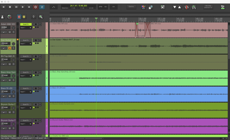
The TCP can now handle three different widths that I have created in sections to be able to show or hide depending on what tasks I am doing.

A full TCP showing all tools and mainly used for when I am recording.

A “mixing” TCP width. That removes the recording and routing tools but keeps the ability to show the track insert FX plugins.

The “editing” TCP that removes all distractions. This allows the fullest view of the rest of the window by taking up as little space as possible, whilst still having useful common tools shown.
Will it be successful?…
…Only time will tell but I certainly like the look of it more now.